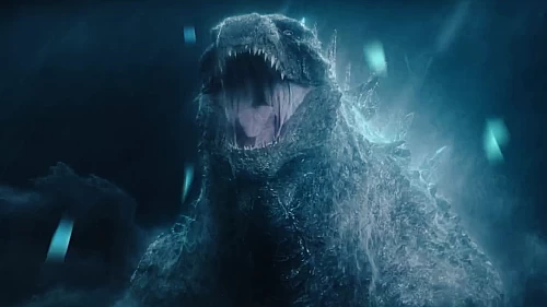
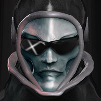
Godzilla WIP part 3
This is my newest progress of my yet unfinished artwork.. Okay,im lazy and slow..But i believe that art cannot be rushed.. :p

10 Replies

@GODZILLASER : I use adobe photoshop and Paint Tool SAI :)
@Devianteist : Your profile picture is also sexy..lol
looks great!
Dopepope:experimental aesthetics
zBrush commissions available upon request. email me here:
dope@dopepope.com

Incredible. It looks so much like him.
"There is nothing noble in being superior to your fellow man; true nobility is being superior to your former self." - Ernest Hemingway.
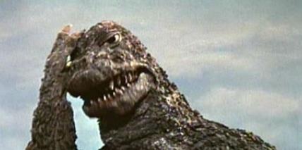
It's not bad, I'll say that. For being done in photoshop and other things on the computer, it's pretty damn good.
If I may, I'd like to provide some constructive criticism and some advice on how you can improve upon it.
First of all, the folds under his eyes are doo deep and go too far down his face towards the back of his head. Those elongated "U" shaped ridges are much tighter to his cheek bone area, but right now it looks like his entire face is caved in from the middle of his nose to to halfway down his head.
So my advice for making that a bit tighter and better is to get rid of the largest ridge on the bottom. It's too long and makes it look like the whole side of his head is an eye socket. So take that ridge out. Maybe leave a little bit of it rght beneath the eye, but keep it going straight back instead of curving up or it will still look like an eye socket extention.
Next is Godzilla's lower jaw. Right now, his jaw doesn't go back far enough, nor is it big enough, to give that powerful animal impression. It looks more like the lower part of a beak with some teeth. Take a look at some of the other Godzilla photos that are online and note how large his lower jaw is. Especially the hinge of his jaw, which is a large circular shape.
And lastly, Godzilla's mouth as a whole. It's a bit too short and it looks stubby almost like a pug. His mouth isn't as long as the original Toho series in this movie, but it's a bit longer than what you have. Just give it a tiny extension and it should be just fine. But right now it's too short.
So that's the end of my constructive criticism. If some of it came off as harsh, then I apologize. I'm just trying to be honest and give you as good of an explanation as I can to help you understand the things which I believe could use improvement. It's a good piece so far for sure, don't get me wrong. I'm not trying to knock it in any way. I'm just being honest and letting you know what areas I believe are weakest.
Hope it helped!

I think you should fix the lighting. Other than that, I'm loving it! You should try GIMP 2.6 its free but its like PS
@All thank you so much..I realise this isnt finish yet and still had much more things to add..Arigatou Mina-san!
@TW_G-Fan 2014 : OMG I never receive this awesome and in depth criticism before..thaks,ill do my best to fix it!
@Demplex : I use SAI,i think it's better in mixing colour